Branding Genius: Heinz Ketchup’s Deliciously Blurry Campaign
Branding agency TAXI with a playful take on a tomato ketchup classic
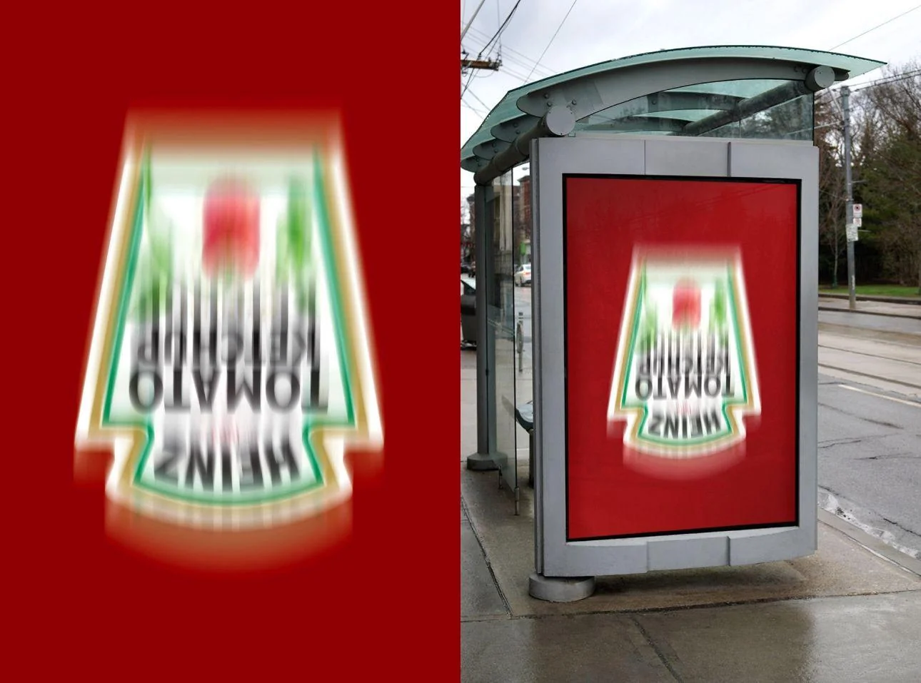
At first glance, you might think someone seriously messed up at the printing press.
The iconic Heinz ketchup label is upside down, smeared, and nearly unreadable.
But look closer—this is no mistake.
This clever out-of-home campaign, crafted by the creative minds at TAXI is a masterclass in branding, turning what could be a disaster into sheer genius.
Upside Genius
The logic behind this fuzzy, topsy-turvy ad is simple yet brilliant. Heinz wants to remind us of something every ketchup lover knows: their ketchup is thick, deliciously thick.
So thick, in fact, that getting it out of the bottle requires a little bit of effort.
You’ve got to flip it over, give it a good shake, and wait for that rich, tomatoey goodness to flow.
By blurring the label and turning it upside down, Heinz is playfully nodding to that familiar moment when you’re trying to coax every last drop out of the bottle.
What’s more, this campaign hit the streets just as a new competitor was making its entrance. Instead of going head-to-head in a straightforward comparison, Heinz leaned into what makes them stand out—nostalgia and brand recognition.
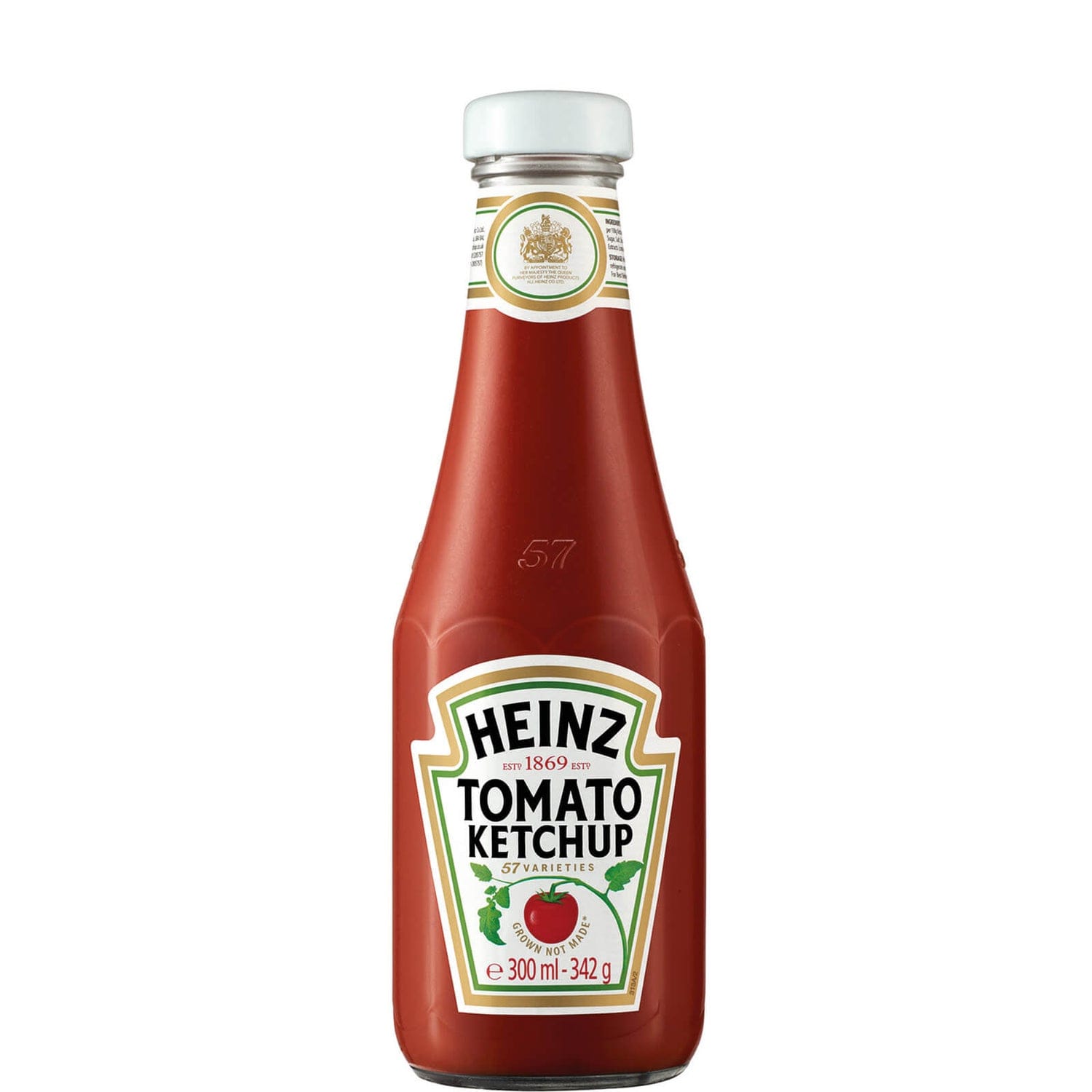
The ad banks on the fact that Heinz’s label is so iconic, so ingrained in our minds, that even when it’s distorted beyond belief, we still know exactly what we’re looking at.
It’s a bold move that speaks to the strength of their brand identity, turning a potential challenge into an opportunity to deepen the connection with consumers.
Heinz’s blurry, upside-down ad cuts through the noise with a wink and a nudge, reminding us that sometimes, all it takes is a simple, smart idea to make an unforgettable statement.
So next time you’re struggling to get that last bit of ketchup out, just remember: it’s not just thick, it’s Heinz-thick.


