
Verizon Has a New Logo
There's some new branding on the Verizon
Verizon, the telecommunications giant we all know, is shaking things up.
The company has just unveiled a major redesign of its corporate logo—the first in over nine years. The new look features a sleek, glowing "V" and aims to signify more than just a fresh coat of paint.
But what’s behind this shift, and what does it mean for the future of Verizon?
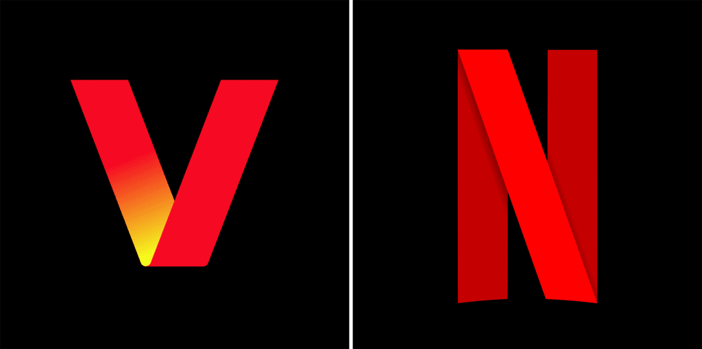
The Versatile "V"
When you first see the new Verizon logo on those poster mockups, you might think, "Wow, this is different." And you'd be right. The new "V" isn’t just a static symbol; it's designed to be versatile, and able to adapt to various contexts and corporate partners.
Or at least this is what Verizon would want you to believe. The more cynical are suggesting that it bears a design language that's a bit too similar to Netflix.
But perhaps that's why this seems like a move to show that Verizon is evolving from a traditional phone company into a broader media platform that brings you TV, music, and movies. By borrowing a bit of aesthetic from Netflix, Verizon seems to be saying, "Hey, we’re in the entertainment game too!"
But here’s the thing: despite the fancy graphics and the shiny new "V," you probably won't see these treatments in the wild.
These designs are primarily created to impress stakeholders and make for nice office decor. They look great in presentations, but when it comes to communicating a clear idea, value, or offer to customers, they're often not very effective.
More Than Just a Logo
Nine years after its last rebrand, Verizon is still the largest wireless provider in the U.S., but it’s facing challenges. Subscriber growth has slowed, and in a market where data is commoditised, Verizon needs to find new ways to stand out.
This rebranding effort is part of a larger strategy to reposition Verizon as a wireless infrastructure provider and a media powerhouse.
Alongside the new logo, Verizon is also rolling out discounted streaming options for home broadband customers. This is a smart move, as it ties into their new brand identity and offers customers more value.
By positioning themselves closer to the media world—think video games, streaming platforms, and NFL games—Verizon is tapping into lucrative premium-tier subscriptions that could provide a much-needed boost.
In the grand scheme of things, Verizon's rebrand is more than just a logo change. It’s a strategic pivot to stay relevant and competitive in a rapidly changing market.
The glowing "V" is a symbol of this new direction. Still, the success of this rebrand will depend on how well Verizon can deliver on its promise to be a media platform that brings entertainment and connectivity seamlessly into our lives.
So, while the new Verizon logo might catch your eye, it’s what happens next that matters. Will Verizon’s new look and strategy help them connect better with customers and keep them ahead of the curve?


Comments ()